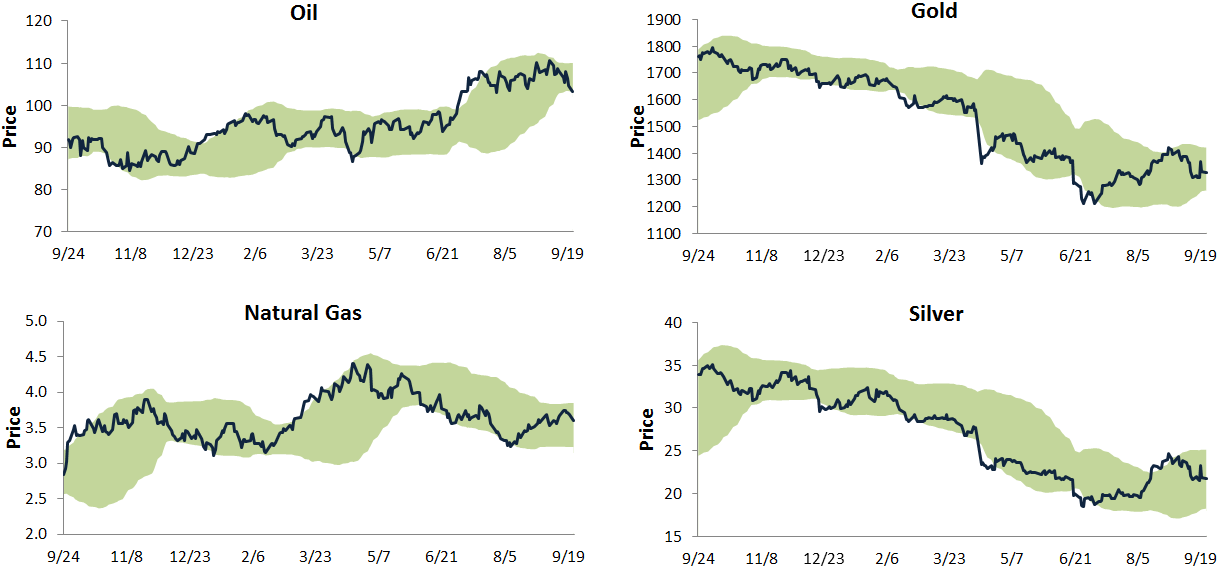
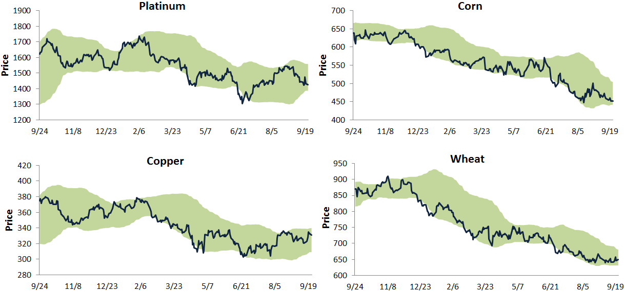
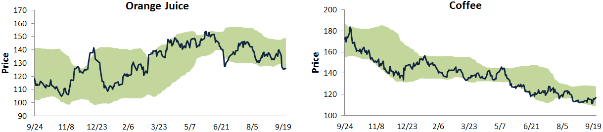
Below is an updated look at our trading range charts for ten major commodities. In each chart, the green shading represents between two standard deviations above and below the commodity’s 50-day moving average. Moves above or below the green zone are considered overbought or oversold.
Nine of the ten commodities shown have been in downtrends for quite awhile now, and oil — which had been in an uptrend — looks like it could join them soon with its most recent break down. The metals looked like they might be able to break out of their downtrends a couple of weeks ago, but they have pulled back recently. Corn, orange juice, wheat and coffee are all at the bottom of their trading ranges with not much upside in sight. It has been a rough year for the commodities asset class. Until these downtrends get convincingly broken, it’s going to be hard for portfolio managers to increase their allocations.
S&P 500 Percentage of Stocks Above 50-Day Moving Averages
The S&P 500 has pulled back about 1.5% from its all-time closing high last Wednesday. Below is a chart showing the daily percentage of stocks in the index trading above their 50-day moving averages over the last year. As shown, the reading is currently at 66%, but what’s telling is the fact that we’ve seen lower highs in the reading each successive time it has peaked so far this year. This means that participation by individual stocks has been dwindling as new market highs have been made. You’ve probably heard that this has become more and more of a “stock picker’s market,” and this chart bears this out.
….read & view more HERE
About Bespoke Investment Group