In this Weekend Report lets take an unbiased look at the HUI, gold and silver to see if there are any big changes taking place to upset the apple cart so to speak. Emotions can turn on a dime in the markets, as you are all well aware of, from bearish to bullish or the other way around in a heart beat. That’s what the markets thrive on. Being open to change and not being married to a position is critical to survival when you put your hard earned capital to work in the markets.
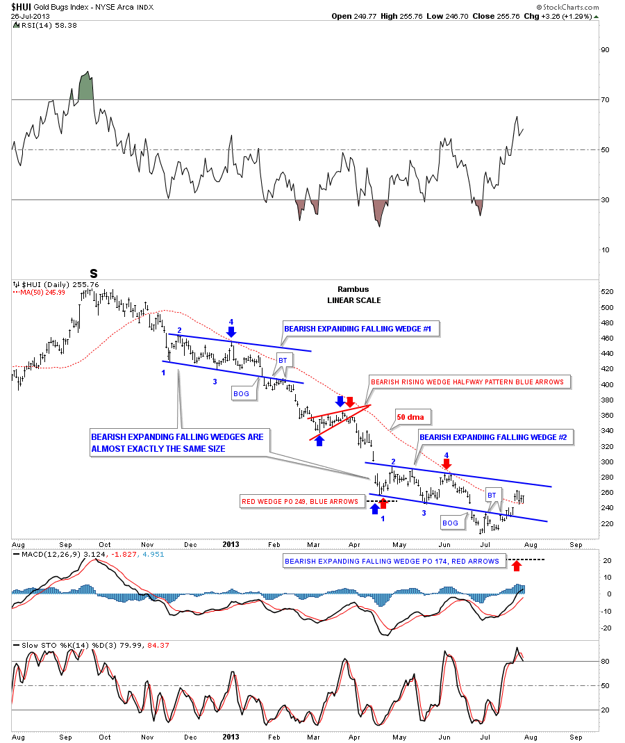
Lets start by looking at a daily linear chart for the HUI that shows the decline that started back in September of last year that formed the right shoulder of the massive H&S top pattern that most staunch gold bugs still can’t see. There are three chart patterns I’m going to show you that formed off the right shoulder high to the current low at 205. First I want you to look at the two blue bearish expanding falling wedges labeled #1 and #2. Those two patterns are almost exactly the same in time and height. For those that want to see what I mean just set your chart to linear scale and go back a little over a year. Draw in the top blue expanding falling wedge, as you see on the chart below, and grab your top rail and pull it on top of where the lower blue wedge is forming. Then do the same thing with the bottom rail of blue wedge #1 and take it down to bottom of blue wedge #2. I’ve added two thin black rectangles that shows your how closely they are to each other in time and height, labeled one through four. There is a lot of information on this chart so I’ll post it right here so you can see how similar these two patterns actually are. Then I will post this same chart with some more information that is relevant to our most recent low.
…..read much more HERE