Silver Rally Chart
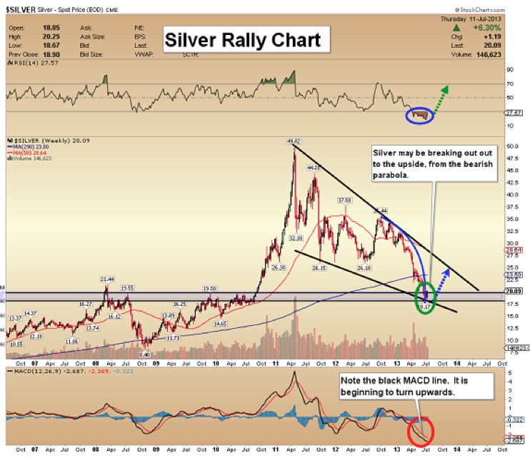
- Silver has come down to key support and is massively oversold. Fundamentally, it’s an outstanding value and a key asset.
- While RSI has yet to move above 30, MACD is turning higher.
- Like gold, silver shows an upside breakout from a parabolic decline.
LT (T-Bond Proxy) Rally Time Chart
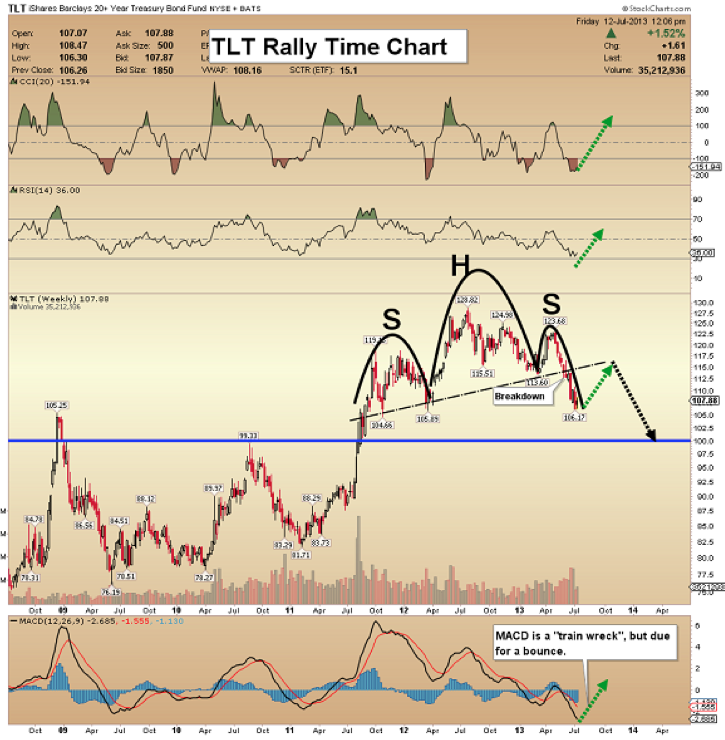
- The US economy is doing well, compared to Europe’s worst performing countries. The most recent jobs numbers growth shows lots of part-time workers. That’s not going to create a thriving economy.
- There is an ominous head & shoulders top pattern on this T-bond proxy chart. Higher interest rates put an enormous strain on the government treasury, and on many over-extended Americans.
FXI (China Stock Market Proxy) Power Volume Chart
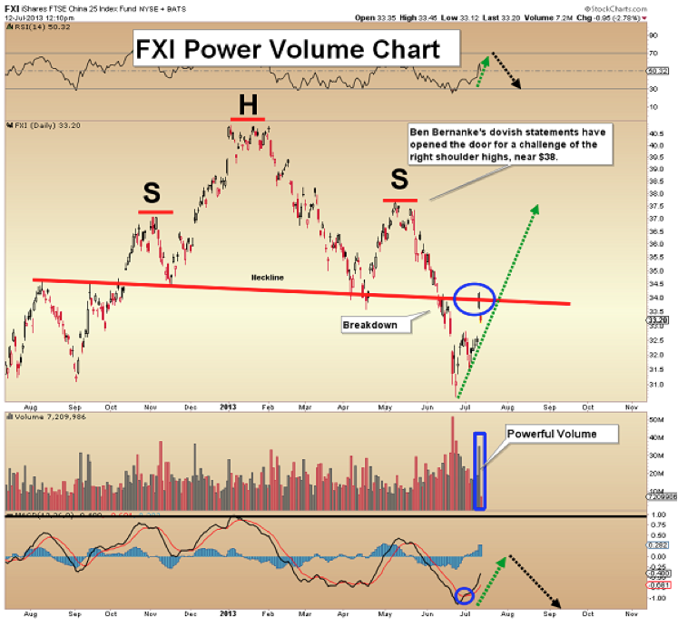
- Ben Bernanke “juiced” the market with his dovish statements on Wednesday. China is the largest manufacturing economy in the world, and the door is open for a substantial rally.
- There is a big h&s top pattern on this chart, but yesterday’s gigantic volume is encouraging. It opens the door to a rally to the right shoulder highs, in the $38 area.
- Unless those highs are taken out, global stock markets remain in the danger zone.
Gold Breakout Chart
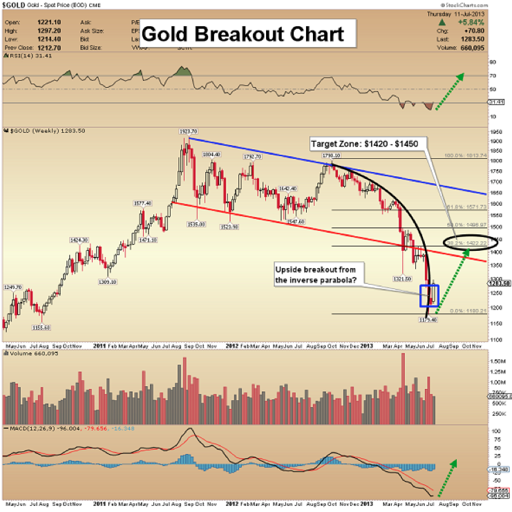
- Both gold and silver have experienced parabolic price declines. The good news for embattled bulls is that this type of chart action usually happens at the end of a decline.
- Even if there is a big rally now, it will take many months for sold-out bulls to regain their confidence, and most of them could end up missing the price rise.
- Note the blue box that I put on the chart. An upside breakout from the inverse parabola may have already occurred.
GDX Arc Of Profits Chart #1
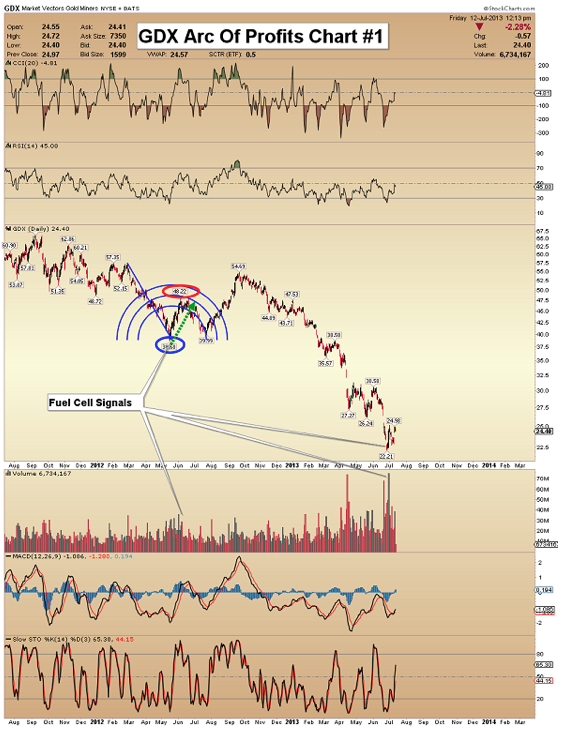
- If an investor believes the price is ready to rally, the arc tool should be brought into play. Fibonacci arcs can help investors place profit booking orders. In this report, I’m including 4 examples of the arc, using GDX charts.
- This chart shows a decline in 2012, from about $57 to the $38 area. A rally to about $48 took GDX to the 2nd arc.
GDX Arc Of Profits Chart #2
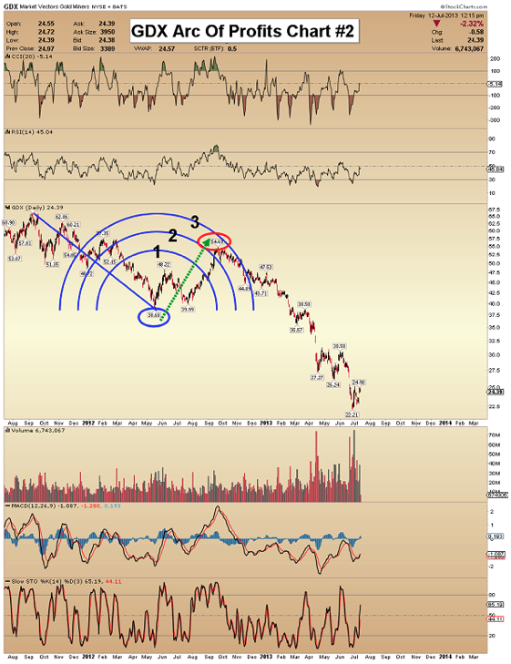
- The chart shows the 2011 – 2012 decline, and the ensuing rally. As a rule of thumb, investors should start booking profits when the price touches the 2nd arc of the pattern. In this case, that worked out quite nicely.
GDX Arc Of Profits Chart #3
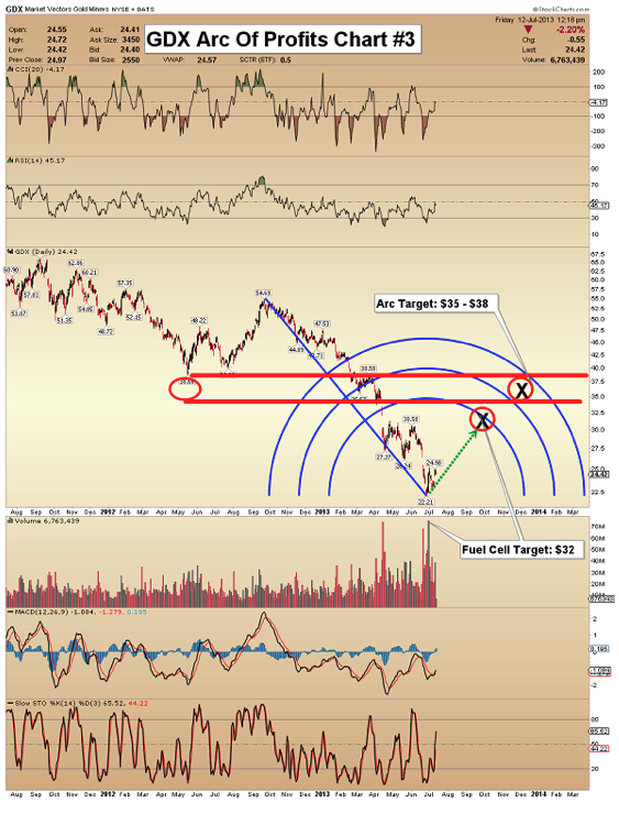
- This arc chart highlights the decline from last summer to the current lows in the $22 area.
- There is also a possible fuel cell volume (FCV) signal in play. The target of FCV signals is the first ring of a Fibonacci arc drawn from the potential low point of the decline. In this case, that’s about $32.
- GDX should be able to rally to $35 – $38, which is the area between the 2nd and 3rd arcs on this chart.
GDX Arc Of Profits Chart #4
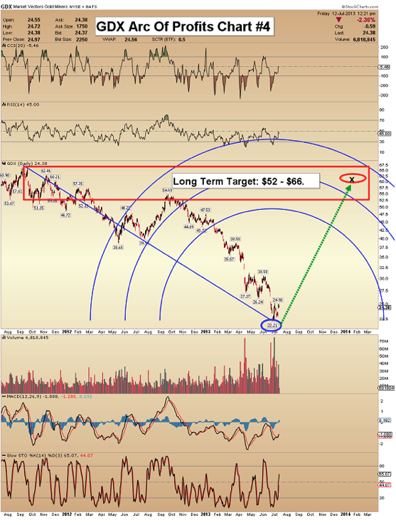
- The fourth arc chart shows the entire gold stocks decline, from the 2011 highs, to the current lows in the $22 area.
- The long term profit booking area suggested by the arc is $52 – $66.
- The Fibonacci arc does not predict that a low has been made. Oscillators, price patterns, and “lady luck” are needed for that. The arc tool is used to suggest good profit booking areas, once a rally begins!
Unique Introduction For Website Readers: Send me an email to alerts@superforcesignals.com and I’ll send you 3 of my next Super Force Surge Signals free of charge, as I send them to paid subscribers.
Thank you!
The Super Force Proprietary SURGE index SIGNALS:
25 Super Force Buy or 25 Super Force Sell: Solid Power.
50 Super Force Buy or 50 Super Force Sell: Stronger Power.
75 Super Force Buy or 75 Super Force Sell: Maximum Power.
100 Super Force Buy or 100 Super Force
Sell: “Over the Top” Power.
Stay alert for our Super Force alerts, sent by email to subscribers, for both the daily charts on Super Force Signals at www.superforcesignals.com and for the 60 minute charts at www.superforce60.com
About Super Force Signals:
Our Super Force signals are created thru our proprietary blend of the highest quality technical analysis and many years of successful business building. We are two business owners with excellent synergy. We understand risk and reward. Our subscribers are generally successful business owners, people like yourself with speculative funds, looking for serious management of your risk and reward in the market.
Frank Johnson: Executive Editor, Macro Risk Manager.
Morris Hubbartt: Chief Market Analyst, Trading Risk Specialist.
Email: