
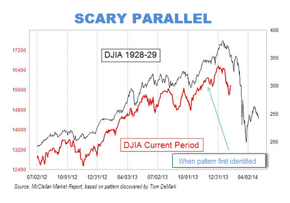
There are eerie parallels between the stock market’s recent behavior and how it behaved right before the 1929 crash.
That at least is the conclusion reached by a frightening chart that has been making the rounds on Wall Street. The chart superimposes the market’s recent performance on top of a plot of its gyrations in 1928 and 1929.
The picture isn’t pretty. And it’s not as easy as you might think to wriggle out from underneath the bearish significance of this chart.

….full article HERE


