

Guess what? The bond market is now very close to saying, “We’ve had enough.” The problem can be illustrated by one chart. Below I include the key chart, courtesy of the Chart Store. Here we see the yield on the “long” 30-year Treasury bond. The long end of the bond market is not controlled or manipulated by the Fed, it’s a free market.
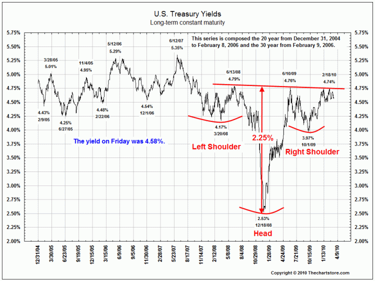
What we see on the chart is a huge well-defined head-and-shoulders bottom formation. The formation is very close to breaking out, and if it does this it means automatic higher interest rates. What would an upside breakout of this formation mean? I believe it would mark the end of the 25 year bull market in bonds. That bull market (a trend of lower interest rates) has been a major force for the great bull market in stocks and the economy that began in the early 1980s. The current yield on the 30-year Treasury bond is 4.62%. Technically, this chart implies that the yield on the long bond could rise to near 7%.
Richard Russell has made his subscribers fortunes. One of the best values anywhere in the financial world at only a $300 subscription to get his DAILY report for a year. HERE to subscribe. Amongst his achievements Richard was in cash before the 2008/2009 Crash and he has been Bullish Gold since below $300
Ed Note: Richard Russell is bullish Silver and holds one of the largest single positions he has held since the 1950’s in the precious metals.