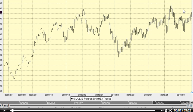
Most writers in the gold community focus on the fact that silver tends to outperform gold in the later stages of a move, but the focus is more reactive, than predictive. I don’t think very many investors in the gold community who are silver buffs really understand what has just transpired in the gold and silver markets.
First off, gold has exploded from what I labelled a “michaelangelic” head and shoulders pattern and targets 1320 or higher, the same as the small ascending triangle. Second, silver has yet to make a new high. Again, the bears see this as a non-confirmation. Again I say, wrong. Quantitative Easing is accelerating and George Soros is pounding the table that the crisis is just getting underway. Just starting. Not ending.
Click HERE or on the image to view the analysis
Third, the bears have built themselves a horrific track record and are making fools of themselves while George Soros and Jim Sinclair are putting their own monster money where their mouths are; gold is going higher, not lower.
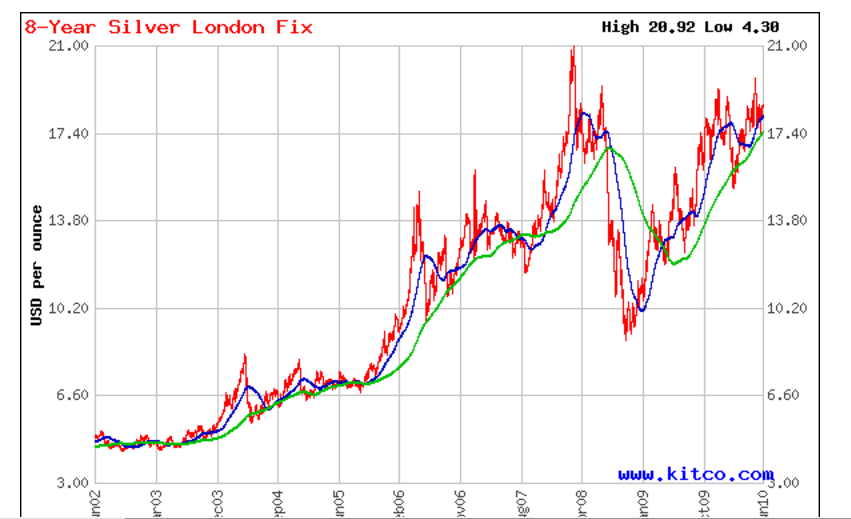
In my view, silver has a bull head and shoulders continuation on the 1 and 2 year charts, and the kitco charts show it better than most. Is it as good as the gold pattern between 680-1033 was? No. Is it powerful? Yes. Silver appears to be making a run at the neckline. If it is successful, I believe the silver price will become so volatile that it becomes virtually untradeable to those with no core position.
So my words to you gamblers out there are: Your time is now to take action. Silver action. That is, “Hi Ho Silver!”, not High Ho let’s buy Junk Bonds and wait for the banksters to maul us!” The worst case scenario is you own one of the world’s greatest assets as the theme of the crisis becomes the banksters’ attack on paper money itself. If price were to decline in dollars per silver ounce, is that such a disaster? I think the risk/reward is skewed massively towards reward, as is the timing.
Kitco Silver Chart This chart tells you all you need to know about what is coming to the metals bears:
Click on the image or HERE for a larger Chart


