
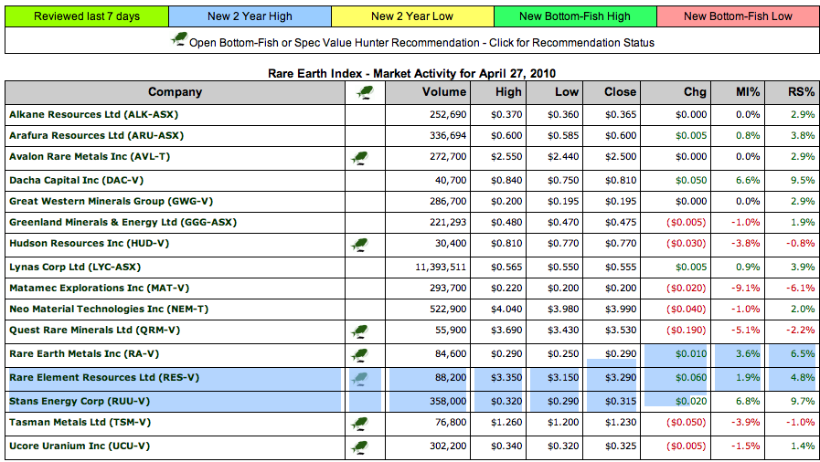
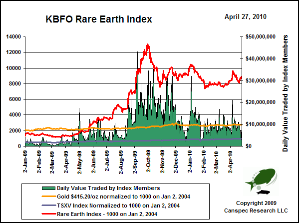
The KBFO Rare Earth Resource Center is designed to help investors get acquainted with the rare earth sector, track the KBFO Rare Earth Index, and get quick access to rare earth related articles published on Kaiser Bottom-Fish Online. The Rare Earth Index consists of Australian and Canadian stock exchange listed companies with advanced rare earth deposits or downstream processing operations. Details are available through our KBFO Members Only Rare Earth Index report. For a general overview of the logic driving Rare Earth Mania see Making Sense of the Emerging Rare Earth Mania posted on ResourceInvestor.com. Most people, however, still think the fuss about rare earths is little more than yet another commodity bubble (Economist: The hunt for rare earths – Oct 8, 2009.
Ed Note: for larger charts go HERE
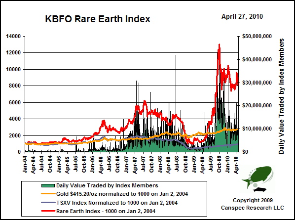
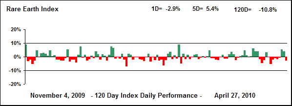
Ed Note: for all larger charts as below go HERE
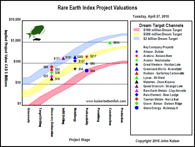
Rare Earth Production and Global Resource Base
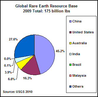
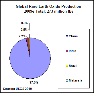
The Global REO Production chart above based on USGS estimates for 2009 paint a grim portrait of China producing 97% of all rare earth oxides, with the remainder from India, Brazil and Malaysia produced in the form of monazite based heavy mineral sands. The other chart suggests that more than half the world’s resource base exists outside of China.
….continue reading and view 18 more charts in the last 2/3rds of the article HERE
