

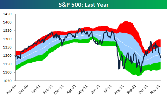
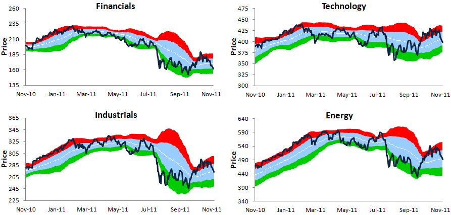
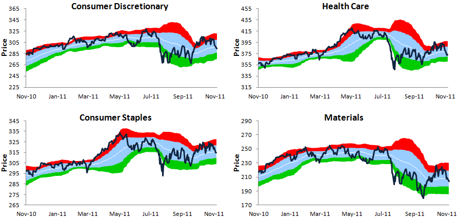
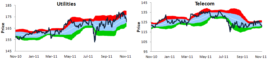
One-Year Trading Range Charts for the S&P 500 and Its Ten Sectors
Below we provide our one-year trading range charts for the S&P 500 and its ten sectors. In each chart, the blue shading represents the sector’s “normal” trading range, which is between one standard deviation above and below the 50-day moving average (the white line). The red zone represents between one and two standard deviations above the 50-day, while the green zone represents between one and two standard deviations below the 50-day. Moves into or above the red zone are considered overbought, while moves into or below the green zone are considered oversold.
While the S&P 500 has pulled back more than 8% since its intraday high on October 27th, it’s still trading within its “normal” trading range. To get to oversold, the index needs to fall another 2.11%. For bears that are hoping for farther declines, there is still quite a bit of downside room to run before an oversold bounce would be expected.
For larger images click HERE
For larger images click HERE
For larger images click HERE
To receive and analyze these charts on a regular basis, sign up for a Bespoke Premium membership today. Please call 914-315-1248 with any questions.