Bried Excerpt from Richard Russell’s Dow Theory Letters. One of the best values anywhere in the financial world at only a $300 subscription to get his DAILY report for a year. HERE to subscribe. Amongst his achievements Richard was in cash before the 2008/2009 Crash and he has been Bullish Gold since below $300 Ed Note: Richard Russell is bullish Silver and holds one of the largest single positions he has held since the 1950’s in the precious metals.
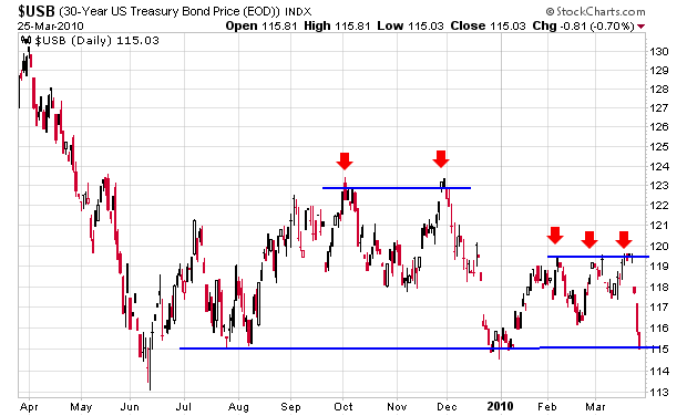
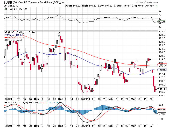
As subscribers know, I’ve been keeping an eagle eye on the daily chart of the 30-year Treasury bond. As of yesterday, the “long bond” had sunk exactly to its support at around 114. If support breaks, interest rates will be heading dangerously higher. The chart shows a double top (first two red arrows). Then a break to the downside and a formation showing a triple top (second set of three red arrows). As of yesterday’s close, the 30-year T-bond was sitting exactly on critical support. If bonds are down today, it won’t be pretty. (This paragraph was written Thursday evening, and yes, I do work at nights.) Ed Note: Friday’s Bond Chart below show’s Bonds did not fall further


WHO WILL BUY U.S. BONDS?
by David Rosenberg
Sentiment is so negative on the U.S. Treasury market it’s not even funny. Everyone seems to focus strictly on supply without realizing that the only way to predict a price is by forecasting both supply and demand. On its own, supply looks worrisome given the Administration’s bent on running huge fiscal deficits (and it just unveiled a new set of initiatives to reverse the foreclosure crisis).
What is ignored in so much analysis is the demand side of the equation — boomer households, for example, have only 6% of their assets in bonds versus nearly 30% in real estate and equities. They have about $8 trillion that they can put to use towards income-oriented portfolio strategies and in fact this powerful demographic trend is already underway. The banking sector is sitting on $1.3 trillion in cash and if it ever decided to play the yield curve, as it did coming out of the credit crunch of the early 1990s, it too could provide up to a trillion dollars of support for the bond market (even if Bill Gross sits on the sidelines).
Finally, it may pay to have a look at what is happening at the State and local government level when it comes to unfunded pension liabilities and the modifications that are coming from the General Accounting Standards Board (GASB). The era of relying on 8% return assumptions are no longer tenable in a world of sub-4% nominal GDP growth. Looking at the latest Fed Flow of Funds report, State and local government pension funds are sitting on an equity allocation of nearly 60%, but only have 6.5% of their financial assets in treasury, notes and bonds.
From the mid-1960s up until the mid-1990s, the bond share was consistently between 20-30% and moving back into this range would involve roughly $500 billion of an allocation shift towards the fixed income market. I highly urge everyone to read the article on page A2 of today’s WSJ titled Showing the Woes in Public Pensions.
Ignoring the demand for fixed income product would have left you with a dramatically incorrect forecast of where JGB yields were headed in the aftermath of its credit collapse two-decades ago. There were at least seven spasms to the upside, but the primary trend in bond yields was down.
For more from David’s 17 page Market Musings and Data Deciphering go HERE to subscribe for his FREE Reports (He also publishes a summary of his full report)

Go HERE to subscribe for his FREE Reports
