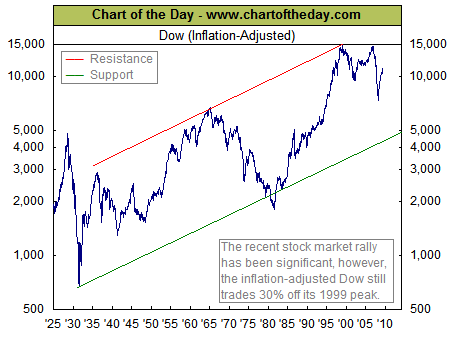

For some long-term perspective, today’s chart illustrates the Dow adjusted for inflation since 1925. There are several points of interest. For one, when adjusted for inflation, the bear market that concluded in the early 1980s was almost as severe as the one that concluded in the early 1930s. Also, the inflation-adjusted Dow is a little more than double where it was at its 1929 peak and trades 61% above its 1966 peak — not that spectacular of a performance considering the time frames involved. It is also interesting to note that the Dow is up 65% from its March 9, 2009 low which is actually slightly more than what the inflation-adjusted Dow gained from its 1966 peak to today.
Get your free Chart of the Day HERE or at http://www.chartoftheday.com/
